There are some tutorials on YouTube. Some of these are fairly advanced and may not be appropriate for the Moving.Subject project, but they're available for reference.
These are brief clips on using Adobe Premiere 6.5
Editing Tools
Adobe Premiere 6.5 - Transitions
The following tutorials are from XSLIMITS .
Bleach Bypass tutorials - Adobe Premiere Pro
Dream Look tutorial
Night Vision tutorial
Thursday, March 29, 2007

Wednesday, March 28, 2007
Web.Body Gallery

I'm building the home page for our web.body site, and discovered several people still haven't completed their assignment. Your names are listed on the image above. Please email me when you've uploaded your project.
Tuesday, March 27, 2007
Doppelgängers? Parallel Universes? Time Travellers?

Photo credit: John Titor's Time Machine, as posted by him on an internet message board
Kylie Minogue's music video, "Come Into My World," exemplifies a looping narrative - characteristic of new media narratives, from video games to flash animations. (see article "Generation Flash: Turntable and Flash Remixing" - click here.) Does it also suggest a changing world view, one that takes for granted parallel universes?
In the vernacular, "Doppelgänger" has come to refer (as in German) to any double or look-alike of a person—most commonly an "evil twin". The word is also used to describe the sensation of having glimpsed oneself in peripheral vision, in a position where there is no chance that it could have been a reflection.
They are generally regarded as harbingers of bad luck. In some traditions, a doppelgänger seen by a person's friends or relatives portends illness or danger, while seeing one's own doppelgänger is an omen of death. In Norse mythology, a vardøgr is a ghostly double who precedes a living person and is seen performing their actions in advance.
The idea of doppelgängers is also seen in fiction involving time travel and parallel universes. In this case, the doppelgänger really "is" the doubled person, but from a different timeline or different version of the universe.
Source: Wikipedia
Do you have an exact double somewhere in the world? Can a person be in two places at once? There are many intriguing accounts throughout history of people who claim to have either encountered apparitions of themselves - their doppelgangers - or have experienced the phenomenon of bilocation, being in two separate locations at the very same time.
"Doppelganger" is German for "double walker" - a shadow self that is thought to accompany every person. Traditionally, it is said that only the owner of the doppelganger can see this phantom self, and that it can be a harbinger of death. Occasionally, however, a doppelganger can be seen by a person's friends or family, resulting in quite a bit of confusion.
In instances of bilocation, a person can either spontaneously or willingly project his or her double, known as a "wraith," to a remote location. This double is indistinguishable from the real person and can interact with others just as the real person would.
For some stories about reported Doppelganger incidences, click here.
_______________________________________
Continuing on the science fiction theme of parallel universes, there is the curious case of John Titor. John Titor is the name used by the person or persons claiming to be a time traveler from the year 2036 who posted on several time-travel–related bulletin boards during 2000/2001. In these posts he made numerous ambiguous predictions about events in the near future, starting with events in 2004. Whether or not John Titor was a hoax has been a topic of controversy on web-based paranormal discussion boards.
In his online postings, Titor claimed to be an American soldier from the year 2036 who was assigned to a government time travel project. He was supposedly sent back to 1975 to retrieve an IBM 5100 computer which he claimed was needed to "debug" various legacy computer programs in 2036. According to IBM engineer Bob Dubke, Titor's statements regarding the IBM 5100's ability to emulate and debug mainframe systems were correct. It has been stated that this information was not publicly available when Titor made his declaration. He claimed he was making a stopover in 2000 in order to observe the effects of the Y2K bug, and this is when he started posting to the discussion groups.
When asked why the time machine did not lead to time travel paradoxes, he stated that this was explained through the many-worlds interpretation (or as it was called, the Everett-Wheeler model), which he claimed was proven to be correct in the future. Simplistically, the Many Worlds theory suggests that for any event that could have different possible outcomes, every one of those outcomes occurs in a separate "universe". According to the posts, a time traveler does not actually enter their own past, but some other, similar, past. When asked to use the time machine to perform some paradoxical action, he replied that that would only affect this universe, but not his. He appeared to imply that there were many worldlines, and his time machine could not control its outgoing destination exactly, but could return to a worldline exactly similar to his own home. His originating "worldline" would, in turn, receive a John Titor exactly similar to the original. Therefore, his original "worldline" would indeed receive the benefit of his mission.
For more information on John Titor, visit Wikipedia, or the John Titor web site.
______________________________________
Meeting the Multiverse

To test the theory of parallel universes, or multiverses, a £2.6 billion CERN laboratory is being built, in part to see if it can find evidence of their existence. CERN is the European Organization for Nuclear Research, the world's largest particle physics centre. It sits astride the Franco-Swiss border near Geneva.
CERN is a laboratory where scientists unite to study the building blocks of matter and the forces that hold them together. CERN exists primarily to provide them with the necessary tools. These are accelerators, which accelerate particles to almost the speed of light and detectors to make the particles visible.
"String theory brought to the forefront the idea that there may be more to the universe than just three spatial dimensions — height, width, length — plus time. There could be six more dimensions that we fail to perceive, possibly because they are so tiny and curled up and hidden from view, or perhaps because some are infinite in extension. These new spatial directions are the “warped passages” of the book’s title: a concept that has dominated Randall’s thinking during the last several years. This book is a chronicle of her theoretical adventures within this brave (and strange) new world.
At first, theorists postulated that it was the strings themselves that oscillated within these many dimensions, allegedly creating the various particles found in the cosmos. More recently, that idea has expanded to include membranes, or “branes” for short. A brane is essentially a slice out of that multidimensional world. According to this view, we might be living on a four-dimensional brane (space + time), which itself is immersed inside the full dimensional realm known in its entirety as the “bulk.” Such entities as light waves, electrons, and protons are confined to our specific brane, according to Randall, much like water droplets trapped on a shower curtain.
Given this setup, Randall offers a new and mind-blowing take on the universe — or “multiverse,” as we may be residing amid other branes, other parallel universes, within this complex higher-dimensional domain. “Thinking about branes makes you aware of just how little we know about the space in which we live,” she writes. “The universe might be a magnificent composition linking intermittent branes.” If there is life on those other branes, they likely experience different forces and possibly even different forms of matter. Randall stresses that, despite the science-fiction quality to this notion, evidence for these higher dimensions might actually be obtainable in the foreseeable future. “Experimental tests of competing hypotheses are near at hand, and within a decade,” she predicts, “there should be a dramatic revision in our understanding of fundamental physical laws that will incorporate whatever is discovered....”
"Meeting the Multiverse," Marcia Bartusiak, Harvard Magazine, November-December 2005
Spun (2002)
Spun is a 2002 independent movie directed by Jonas Åkerlund and written by Creighton Vero and Will de los Santos. This film holds the record for the most cuts per minute in a movie. The film includes more than 5,000 edits. The film was shot in 22 days.
Plot
The movie details the lives of individuals surrounding a methamphetamine cook, drug addiction, and the multitude of consequences that can result from drug abuse. The film’s title is a reference to the slang term for the way users feel when being high on the drug. This is Åkerlund's début as a film director after being better known for his work on music videos. The film includes appearances from Rob Halford of Judas Priest fame, Billy Corgan, China Chow, Tony Kaye, Ron Jeremy, and Deborah Harry.
Critical reaction
The film got mixed reactions, with some analysts remarking that the film added nothing new to the genre of drug movies. Time Out London was particularly harsh, accusing the film of "smug amoralism", since the director is simply re-using other people's ideas and techniques. Click here to read the article.
Roger Ebert was more empathetic in his review, where he described the film as having "effortlessness wickedness." His main appraisal is the fact that the film in no way attempts to romanticise any of the characters. He does however, expicitly mention the similarities between this and the earlier Requiem for a Dream.
What I find interesting about the movie is:
1. the expansion and contraction of time through the use of special effects and editing techniques
2. the use of filmic, visual based lexicons to simulate inner psycho-physiological states, such as the "speeding up" of mental processes, release of adrenaline, hallucinatory states (cartoon sequences), auditory disturbances and the contraction of time from exhaustion and withdrawal
3. While the film employs traditional "master plots" such as wretched excess and descension, it avoids a solid plot with clear conflict and resolution
4. The clearly digital, non-linear editing techniques add to the synthetic and chemical feel of the film, emulating the effects of methamphetamine addiction
5. The music video/video game visual techniques and pacing of the film help convey the lack of meaning in the crystal meth's life and the quality of "living on the surface."
Monday, March 26, 2007
About Transitions
The visual change from one clip to another is called a transition. To add nuance, texture, or special effects between video clips, Premiere provides a variety of transitions, such as wipes, zooms, and dissolves. The simplest transition is the cut, where the last frame of one clip leads directly into the first frame of the next. The term comes from film editing, where a cut means splicing two shots together. Very often, a cut is the most effective way to move from one scene to the next. Other transitions, however, are useful in setting a mood or adding a creative element to your project.
The transitions included with Premiere typically involve the end of one clip and the beginning of the next. For example, the Cross Dissolve transition might dissolve the last second of one clip into the first second of the next. Some transitions, such as Inset, can involve both clips in their entirety, depending on the desired effect.
Using the Transitions palette

Premiere includes over 75 transitions, which you choose from the Transitions palette. Within the palette, transitions are organized by type, in folders. Each transition is represented by an icon depicting how it works, where A is the first clip and B is the second. To help you choose, you can animate these icons and view brief descriptions. In addition, you can preview the transition effect with actual frames from the two clips involved in the transition.

When creating a Transition, the two separate clips must overlap slightly. When working in A/B Format on the Timeline, one clip goes on Video 1A, and the overlapping clip goes on Video 1B, or vice versa. Then the Transition is dragged onto the Transition portion of the Timeline, and shortened or lengthened as needed.
To preview the Transition, hold down the ALT key on your keyboard, and drag the Timeline Slider over the transition to preview. Make adjustments until you are satisfied with the transition, then click on the Transition area on the Timeline to select it, and press RETURN on your keyboard. This RENDERS the Transition.
--------------------------------------------------------------------------------
About Transparency
In video or film, transparency allows one clip to show through another, creating composites, transitions, or special effects. The opacity of a clip or portion of a clip determines its level of transparency. At 100% opacity, an image contains no transparency at all; at 0% opacity, the image is completely transparent, allowing other clips to show through. At other percentages, the image is partially transparent, allowing other underlying images to be visible at the same time. The brightness values of a clip's alpha channel, an additional grayscale or monochrome channel in an RGB image, also determine the clip's opacity.
Certain parts of clips can be made transparent using tools called keys. A key finds pixels in an image that match a specified color or brightness and makes those pixels transparent or semitransparent, depending on the type of key. This process is called keying, or keying out the color. Keys can also use a clip's alpha channel to create transparency.
You can create transparency in a clip only after you have placed it in a superimpose track. By default, each new project includes one superimpose track, called Video 2. You can add up to 97 superimpose tracks.
--------------------------------------------------------------------------------
Fading
In addition to making portions of a clip transparent with keys, you can also adjust the opacity of the entire clip to fade it in or out. You can use fading to create additional transitional effects or to create simple superimposing.
--------------------------------------------------------------------------------
Using the Video Opacity rubberband
When you place a clip in a superimpose track, an Opacity rubberband, appears beneath it (you must expand the superimpose track to display the Opacity rubberband). The Opacity rubberband specifies the opacity of the entire clip. By adding handles, you can adjust the opacity of a clip.
The Opacity rubberband adjusts opacity after any keys have been applied. In other words, moving the Opacity rubberband adjusts the opacity for opaque, transparent, and semitransparent regions in the clip.
To adjust fading:
1 Place a clip in a superimpose track. If necessary, click the triangle to the left of the track name to expand the track, or Option-click (Mac OS) or Alt-click (Windows) the triangle to expand all the superimpose tracks at once.
2 Click the red Display Opacity Rubberbands icon () to display the opacity rubberband.
3 With the selection tool selected, position the pointer over the top of the Opacity rubberband. The pointer changes to a pointing finger with red plus (+) and minus (-) signs.
4 Click to create a handle (a small red square), and drag the handle up or down to adjust the fading. The opacity percentage appears in the Info palette and updates as you drag a handle. Press the Shift key with a handle selected to view the opacity percentage and to change the percentage in 1% increments for finer gradations.
When the handle is at the top of the panel, the image is fully opaque; when the handle is at the bottom of the panel, the image is transparent. The line between two handles indicates the direction, length, and speed of the adjustment. The steeper the angle, the more sudden the change.

Clicking the Opacity rubberband to create an opacity handle (left) and dragging it to decrease opacity (right)
5 Repeat the above step to create as many handles as needed.
6 To delete a handle, drag it out of the superimpose track.
To create two opacity handles:
1 Select the fade scissors tool ().

2 Click the Opacity rubberband where no handles exist. Two adjacent handles appear.
3 Drag the new handles up or down to make a sharp increase or decrease in opacity.
To adjust the opacity of a specific segment:
1 Select the fade adjustment tool ().

2 Drag the line segment up or down. You can set the opacity of the entire clip to a constant value by adjusting the opacity rubberband in this manner before creating handles.
--------------------------------------------------------------------------------
Compositing
Special effects for film or video are often created by shooting a scene against a color screen. After the footage is digitized, the color screen is then made transparent with a key. The first scene, or clip, is placed over a second clip, which usually includes some sort of background scene. The result forms a composite, where the background is visible wherever the first clip is transparent, making the first clip appear to belong with the background.
Composites are often used in feature films where, for example, an actor appears to dangle from a helicopter or appears to be floating in outer space. In this case, the actor is shot in an appropriate position against a color screen, and after making the color transparent, the actor's scene is superimposed over the backdrop. Color screens are usually blue or green because these colors are relatively absent from skin or hair color.
The transitions included with Premiere typically involve the end of one clip and the beginning of the next. For example, the Cross Dissolve transition might dissolve the last second of one clip into the first second of the next. Some transitions, such as Inset, can involve both clips in their entirety, depending on the desired effect.
Using the Transitions palette

Premiere includes over 75 transitions, which you choose from the Transitions palette. Within the palette, transitions are organized by type, in folders. Each transition is represented by an icon depicting how it works, where A is the first clip and B is the second. To help you choose, you can animate these icons and view brief descriptions. In addition, you can preview the transition effect with actual frames from the two clips involved in the transition.

When creating a Transition, the two separate clips must overlap slightly. When working in A/B Format on the Timeline, one clip goes on Video 1A, and the overlapping clip goes on Video 1B, or vice versa. Then the Transition is dragged onto the Transition portion of the Timeline, and shortened or lengthened as needed.
To preview the Transition, hold down the ALT key on your keyboard, and drag the Timeline Slider over the transition to preview. Make adjustments until you are satisfied with the transition, then click on the Transition area on the Timeline to select it, and press RETURN on your keyboard. This RENDERS the Transition.
--------------------------------------------------------------------------------
About Transparency
In video or film, transparency allows one clip to show through another, creating composites, transitions, or special effects. The opacity of a clip or portion of a clip determines its level of transparency. At 100% opacity, an image contains no transparency at all; at 0% opacity, the image is completely transparent, allowing other clips to show through. At other percentages, the image is partially transparent, allowing other underlying images to be visible at the same time. The brightness values of a clip's alpha channel, an additional grayscale or monochrome channel in an RGB image, also determine the clip's opacity.
Certain parts of clips can be made transparent using tools called keys. A key finds pixels in an image that match a specified color or brightness and makes those pixels transparent or semitransparent, depending on the type of key. This process is called keying, or keying out the color. Keys can also use a clip's alpha channel to create transparency.
You can create transparency in a clip only after you have placed it in a superimpose track. By default, each new project includes one superimpose track, called Video 2. You can add up to 97 superimpose tracks.
--------------------------------------------------------------------------------
Fading
In addition to making portions of a clip transparent with keys, you can also adjust the opacity of the entire clip to fade it in or out. You can use fading to create additional transitional effects or to create simple superimposing.
--------------------------------------------------------------------------------
Using the Video Opacity rubberband
When you place a clip in a superimpose track, an Opacity rubberband, appears beneath it (you must expand the superimpose track to display the Opacity rubberband). The Opacity rubberband specifies the opacity of the entire clip. By adding handles, you can adjust the opacity of a clip.
The Opacity rubberband adjusts opacity after any keys have been applied. In other words, moving the Opacity rubberband adjusts the opacity for opaque, transparent, and semitransparent regions in the clip.
To adjust fading:
1 Place a clip in a superimpose track. If necessary, click the triangle to the left of the track name to expand the track, or Option-click (Mac OS) or Alt-click (Windows) the triangle to expand all the superimpose tracks at once.
2 Click the red Display Opacity Rubberbands icon () to display the opacity rubberband.
3 With the selection tool selected, position the pointer over the top of the Opacity rubberband. The pointer changes to a pointing finger with red plus (+) and minus (-) signs.
4 Click to create a handle (a small red square), and drag the handle up or down to adjust the fading. The opacity percentage appears in the Info palette and updates as you drag a handle. Press the Shift key with a handle selected to view the opacity percentage and to change the percentage in 1% increments for finer gradations.
When the handle is at the top of the panel, the image is fully opaque; when the handle is at the bottom of the panel, the image is transparent. The line between two handles indicates the direction, length, and speed of the adjustment. The steeper the angle, the more sudden the change.

Clicking the Opacity rubberband to create an opacity handle (left) and dragging it to decrease opacity (right)
5 Repeat the above step to create as many handles as needed.
6 To delete a handle, drag it out of the superimpose track.
To create two opacity handles:
1 Select the fade scissors tool ().

2 Click the Opacity rubberband where no handles exist. Two adjacent handles appear.
3 Drag the new handles up or down to make a sharp increase or decrease in opacity.
To adjust the opacity of a specific segment:
1 Select the fade adjustment tool ().

2 Drag the line segment up or down. You can set the opacity of the entire clip to a constant value by adjusting the opacity rubberband in this manner before creating handles.
--------------------------------------------------------------------------------
Compositing
Special effects for film or video are often created by shooting a scene against a color screen. After the footage is digitized, the color screen is then made transparent with a key. The first scene, or clip, is placed over a second clip, which usually includes some sort of background scene. The result forms a composite, where the background is visible wherever the first clip is transparent, making the first clip appear to belong with the background.
Composites are often used in feature films where, for example, an actor appears to dangle from a helicopter or appears to be floating in outer space. In this case, the actor is shot in an appropriate position against a color screen, and after making the color transparent, the actor's scene is superimposed over the backdrop. Color screens are usually blue or green because these colors are relatively absent from skin or hair color.
How to download videos from YouTube

Click here for information on the VideoDownloader.
Download videos from Youtube, Google, Metacafe, iFilm, Dailymotion... and other 60+ video sites ! And all embedded objects on a webpage (movies, mp3s, flash, quicktime, etc)! Directly!
VideoDownloader adds a small icon on the status bar at the bottom of your Firefox window, and a toolbar button. Just click that and download the video you are watching !
Once the file is downloaded (as an "flv" file - otherwise known as "flash video" file) you must rename the file to "nameofvideo.flv. Then you must convert it to an "mpg" in order to use it in Premiere. To do this, you have to download another program called...
Free Riva FLV Encoder 2.0
Transcode your existing Flash Video (FLV) format files with Riva FLV Encoder. Click here to visit the web site where you can download it.
Once you've selected your INPUT Video, you simply change the name of the the OUTPUT Destination Video File extension to "mpg." Then click the Encode button. It'll take a few minutes, but the mpg video will appear (wherever you saved it).
If you're using an Apple/Mac, try this link for a video download: http://www.apple.com/downloads/macosx/video/visualhub.html.
Storyboarding your Movie
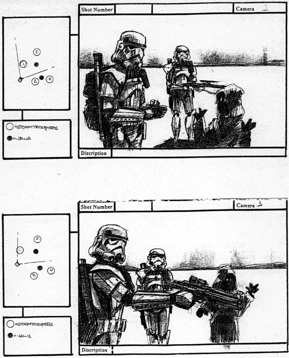
Sample storyboards from 'Troops' - a short film set in the Star Wars universe by Kevin Rubio & Co. Art Director - Eric Hilleary.

Storyboarding is the process of producing sketches of the shots of your script. The end result looks like comic book of your film (without the speech bubbles).
Why do it?
It helps you think about how your film is going to look. You can work faster on set and as pictures communicate better than words it will allow your camera crew to move their camera and lights, for producers to foresee problems, for the art department to know which parts of the location are going to be in shot and so on. Even the actors will get a feel of what they are going to be shooting!
So I need to be an artist?
Well you can be, but looking at storyboards by Hitchcock or Spielberg you have to admit that they can't draw. There are professional storyboard artists that can give you results that look better than the final film. However its a good idea to bash them out yourself, it allows you to experiment quickly and cheaply, testing out different versions of how a scene may look and play on camera.
Storyboarding is especially useful for complex visual sequences e.g. elaborate shots or special effects sequences. Sometimes a film only uses storyboards for difficult sequences other times the entire film is storyboarded. The Coen Brothers (Fargo, The Big Lebowski) storyboard extensively, allowing them to shoot just the sequences they require for editing, saving both time and money.
Hang on though, pictures are still, movies move.
Ah! You got me there. There are a few tricks storyboard artists have up their sleeves to illustrate movement - whether its movement within the frame (actors walking) or the frame moving itself (camera panning etc.).
Arrows - Suppose the camera is tracking in, following a bad guy's footsteps. Draw in an arrow pointing into shot to show the camera's movement. Now the hero's head is pulled back by one of the bad guy's goons. Use an arrow to show the movement of the head being turned. What about a zoom in? From each corner draw in arrows pointing to the centre, draw in a new smaller frame to show the end of the zoom. Generally I try and use thick white arrows to show camera moves and thin black arrows to show objects moving.

The floating frame - What if you want to show the camera panning to show a cityscape, or following a character as they walk through an airport? There's two options here: 1) Illustrate one shot using more than one storyboard frame showing the key stages of the shot's movement across a number of frames or 2) Draw out the entire scene (e.g.. the horizon of a city) and place a frame on it with an arrow indicating the direction of movement.
Transitions - The storyboard can also include transitions in your film. Write these in the gaps between the frames e.g.. DISSOLVE TO :
Storyboarding is the process of producing sketches of the shots of your script. The end result looks like comic book of your film (without the speech bubbles).
Why do it?
It helps you think about how your film is going to look. You can work faster on set and as pictures communicate better than words it will allow your camera crew to move their camera and lights, for producers to foresee problems, for the art department to know which parts of the location are going to be in shot and so on. Even the actors will get a feel of what they are going to be shooting!
So I need to be an artist?
Well you can be, but looking at storyboards by Hitchcock or Spielberg you have to admit that they can't draw. There are professional storyboard artists that can give you results that look better than the final film. However its a good idea to bash them out yourself, it allows you to experiment quickly and cheaply, testing out different versions of how a scene may look and play on camera.
Storyboarding is especially useful for complex visual sequences e.g. elaborate shots or special effects sequences. Sometimes a film only uses storyboards for difficult sequences other times the entire film is storyboarded. The Coen Brothers (Fargo, The Big Lebowski) storyboard extensively, allowing them to shoot just the sequences they require for editing, saving both time and money.
Hang on though, pictures are still, movies move.
Ah! You got me there. There are a few tricks storyboard artists have up their sleeves to illustrate movement - whether its movement within the frame (actors walking) or the frame moving itself (camera panning etc.).
Arrows - Suppose the camera is tracking in, following a bad guy's footsteps. Draw in an arrow pointing into shot to show the camera's movement. Now the hero's head is pulled back by one of the bad guy's goons. Use an arrow to show the movement of the head being turned. What about a zoom in? From each corner draw in arrows pointing to the centre, draw in a new smaller frame to show the end of the zoom. Generally I try and use thick white arrows to show camera moves and thin black arrows to show objects moving.
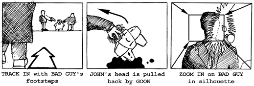
The floating frame - What if you want to show the camera panning to show a cityscape, or following a character as they walk through an airport? There's two options here: 1) Illustrate one shot using more than one storyboard frame showing the key stages of the shot's movement across a number of frames or 2) Draw out the entire scene (e.g.. the horizon of a city) and place a frame on it with an arrow indicating the direction of movement.
Transitions - The storyboard can also include transitions in your film. Write these in the gaps between the frames e.g.. DISSOLVE TO :
Film Editing - Writing with Images
Editing is one of the most creative aspects of filmmaking. The film editor, in conjunction with the director, establishes the pace and structure of a film by connecting various shots to create scenes and sequences that form the final movie. The shots the editor chooses and the ways they are combined set the mood, develop the action, create the rhythm, establish the film's time and space, and guide the viewers' attention. For a typical feature-length film, the editor begins with hundreds of thousands of feet of film and must reduce it to less than 10,000 feet.
In the 1920s, Russian filmmaker Lev Kuleshov conducted a series of experiments designed to demonstrate that when two separate shots are projected in succession, the viewer assumes a connection between them. In one experiment, Kuleshov spliced together a series of shots that had been taken in different places and at different times. The shots were of a waiting man, a walking woman, a gate, a staircase and a mansion. Kuleshov's viewers—who interpreted the sequence as a man and a woman meeting at the gate in front of the mansion—had, in essence, inferred a whole narrative on the basis of seeing only portions of it. This effect allows filmmakers to use exteriors and interiors miles apart and imply that they are in the same place, to have people filmed on different days appear to be talking to each other, to have actors seemingly facing dangerous situations, or to imply that what actors are thinking about is represented by a subsequent cutaway image.
The Kuleshov effect is an editing technique that illustrates how the human brain tries to find connections between objects when viewed together. Other editing techniques rely on how the human eye works. For example, there usually must be an appropriate change in distance for a shot not to seem like a mistake or "jump" cut. The direction in which things move across the screen is also an editorial concern. A car that exits the screen on the right is expected in a subsequent shot to reappear on the left—otherwise the car could be perceived as a different car coming from the opposite direction. Scenes featuring characters in opposition to each other (a hero and villain, for example) usually feature one character continually facing one direction with the other character continually facing the other direction. This keeps the two "sides" clear.
Storyboarding
Here is an example of a shot list for the comic strip illustrated below.
1. LS - Exterior of house. Day.
2. LS - Mom to boy. Boy facing right, Mom facing left. "You should call your Grandma."
3. MS - Overhead. Boy staring at phone facing right. Phone on right side of screen.
4. CU - Mom's face. Mom facing left. "You should call your Grandma."
5. ECU - Boy picking up phone. Hand enters from left side of screen.
6. CU - Boy on phone. Phone on left side of screen. Boy's right ear. "Hello, Grandma."
7. CU - Grandma on phone. Grandma facing left. "Why don't you call more often?"
8. CU - Boy staring at phone. Phone on left side of screen.
9. ECU - Phone. Boy's hand on left side.
10. CU - Boy hanging up phone. Phone on left side of screen. Boy looking at phone.

What happens if, instead of the current sequence, the panels are placed in a different order?
Example #1—1, 7, 6, 9, 10, 2 ,3, 4, 5, 8 (Grandma has called the boy from her house and, after hanging up, the boy is told to call his Grandma by his Mom.)
Example #2—5, 8,1, 7, 6, 9, 10, 2, 3, 4 (The boy calls Grandma, she admonishes him, the Mom says to call Grandma, and after he doesn't respond, reminds him again.)
Example #3—1, 3, 7, 5, 6, 9,10, 2, 4, 8 (The boy thinks about calling his Grandma, imagines what she would say, calls her, hangs up, and is told to call her by the Mom.)
Montage
Film editing can have its own unique logic as well, functioning in much the same manner as the brain with seemingly jumbled thoughts and images creating their own individual meaning. The groundwork for many of these techniques, later used by Alfred Hitchcock and others, was laid by a group of Soviet filmmakers—most notably Lev Kuleshov, Sergei Eisenstein and Vsevolod Pudovkin—who, in the early 1920s, began to experiment with film style and technique and especially with montage.
Montage, or collision editing, is done by splicing together a rapid sequence of carefully selected shots to evoke a specific emotional or intellectual response. The Russians' premise was that each shot derived meaning from the context in which it was placed. If the context changed, the meaning of the shot and the sequence also changed.
Montage, in the modern sense of the word, often refers to sequences where several shots have been edited together to compress a series of events that happen over time (e.g., sequences of young couples falling in love, scenes with flying calendar pages, etc.).
Psycho
In Psycho, Alfred Hitchcock's famous shower scene uses a rapid series of extreme close-ups to build suspense and heighten the sense of panic. Many viewers believe they have seen a very brutal stabbing, even though the knife is never shown piercing the body of the victim.
Potemkin
This sequence in Sergei Eisenstein's 'Potemkin', one of the most famous in film history, recounts the brutal suppression of Russian workers and sympathizers following the death of proto-revolutionary figure Vakulinchuk onboard the Potemkin. Crewmen on the ship had mutinied due to oppressive working conditions and when they arrive at Odessa townspeople came to pay respects for Vakulinchuk and support the workers ... the film itself is based upon the failed 1905 Russian Revolution ... the Odessa sequence is a frightening precursor of government suppression of dissent throughout the 2Oth century, including, but certainly not limited, to Hungary (1956), Czechoslovakia (1968), Soweto (1976), Tiananmen Square (1989) - even Kent State (1970).
The Odessa Steps sequence in Eisenstein's The Battleship Potemkin, is the classic example of montage. In this sequence, the Czar's army is quashing an uprising. Eisenstein uses editing to show the fear of the people, their escalating panic, the tragedy of innocent bystanders as a baby in a carriage careens helplessly down the steps, and the intensifying threat of the soldiers, their guns and artillery.
Source: Young Minds Inspired and The Academy of Motion Picture Arts and Sciences
____________________________________________
For more information on narrative structures and post-production, click here and click here for class notes (courtesy and copyright of Prof. Christopher Moore).
JANET MURRAY: "HARBINGERS OF THE HOLODECK"
Murray, Janet. (1997). "Harbingers of the Holodeck", Hamlet on the Holodeck. New York: Free Press, 1997.
The final quarter of the twentieth century marks the beginning of the digital age. Starting in the 1970s, computers have become cheaper, faster, more capacious, and more connected to one another at exponential rates of improvement, merging previously disparate technologies of communication and representation into a single medium. The networked computer acts like a telephone in offering one-to-one real-time communication, like a television in broadcasting moving pictures, like an auditorium in bringing groups together for lectures and discussion, like a library in offering vast amounts of textual information for reference, like a museum in its ordered presentation of visual information, like a billboard, a radio, a gameboard, and even like a manuscript in its revival of scrolling text. All the major representational formats of the previous five thousand years of human history have now been translated into digital form. There is nothing that human beings have created that cannot be represented in this protean environment, from the cave paintings of Lascaux to real-time photographs of Jupiter, from the Dead Sea Scrolls to Shakespeare's First Folio, from walk-through models of Greek temples to Edison's first movies. And the digital domain is assimilating greater powers of representation all the time, as researchers try to build within it a virtual reality that is as deep and rich as reality itself.
The technical and economic cultivation of this fertile new medium of communication has led to several new varieties of narrative entertainment. These new storytelling formats vary from the shoot-'em-up videogame and the virtual dungeons of Internet role-playing games to the postmodern literary hypertext. This wide range of narrative art holds the promise of a new medium of expression that is as varied as the printed book or the moving picture. Yet it would be a mistake to compare the first fruits of a new medium too directly with the accustomed yield of older media. We cannot use the English theater of the Renaissance or the novel of the nineteenth century or even the average Hollywood film or television drama of the 1990s as the standard by which to judge work in a medium that is going through such rapid technical change.
In 1455, Gutenberg invented the printing press-but not the book as we know it. Books printed before 1501 are called incunabula; the word is derived from the Latin for swaddling clothes and is used to indicate that these books are the work of a technology still in its infancy. It took fifty years of experimentation and more to establish such conventions as legible typefaces and proof sheet corrections; page numbering and paragraphing; and title pages, prefaces, and chapter divisions, which together made the published book a coherent means of communication. The garish videogames and tangled Web sites of the current digital environment are part of a similar period of technical evolution, part of a similar struggle for the conventions of coherent communication.'
Similarly, new narrative traditions do not arise out of the blue. A particular technology of communication-the printing press, the movie camera, the radio-may startle us when it first arrives on the scene, but the traditions of storytelling are continuous and feed into one another both in content and in form. The first published books were taken from the manuscript tradition. Malory's Morte darthur, written in manuscript in 1470, drew on prose and poetry versions of the Carnelot legend in both French and English, which in turn drew on centuries of oral storytelling. The elements of the story were all there already: the rise and fall of the hero Arthur, the gallantry of the knights, the love between Guinevere and Lancelot, and the destruction of the Round Table through civil war. But Malory's prose brought these elements together and introduced colloquial dialogue, more consistent plotting, and a pervasive tone of nostalgia. Fifteen years later, William Caxton took Malory's separate tales and bound them together into a single volume, with descriptive chapter headings that lured readers into the story. Only then, after such long episodic narratives were commonplace in publishing, could Cervantes write a contemporary tale like Don Quixote (1605), which marks the begin, ning of the European novel.
We can see the same continuities in the tradition that runs from nineteenth-century novels to contemporary movies. Decades before the invention of the motion picture camera, the prose fiction of the nineteenth century began to experiment with filmic techniques. We can catch glimpses of the coming cinema in Emily Brontë's complex use of flashback, in Dickens' crosscuts between intersecting stories, and in Tolstoy's battlefield panoramas that dissolve into close-up vignettes of a single soldier. Though still bound to the printed page, storytellers were already striving toward juxtapositions that were easier to manage with images than with words.
Now, in the incunabular days of the narrative computer, we can see how twentieth-century novels, films, and plays have been steadily pushing against the boundaries of linear storytelling. We therefore have to start our survey of the harbingers of the holodeck with a look at multiform stories, that is, linear narratives straining against the boundary of predigital media like a two-dimensional picture trying to burst out of its frame.
Click here to read the rest of the article and learn about "mutliform" narrative.
In the 1920s, Russian filmmaker Lev Kuleshov conducted a series of experiments designed to demonstrate that when two separate shots are projected in succession, the viewer assumes a connection between them. In one experiment, Kuleshov spliced together a series of shots that had been taken in different places and at different times. The shots were of a waiting man, a walking woman, a gate, a staircase and a mansion. Kuleshov's viewers—who interpreted the sequence as a man and a woman meeting at the gate in front of the mansion—had, in essence, inferred a whole narrative on the basis of seeing only portions of it. This effect allows filmmakers to use exteriors and interiors miles apart and imply that they are in the same place, to have people filmed on different days appear to be talking to each other, to have actors seemingly facing dangerous situations, or to imply that what actors are thinking about is represented by a subsequent cutaway image.
The Kuleshov effect is an editing technique that illustrates how the human brain tries to find connections between objects when viewed together. Other editing techniques rely on how the human eye works. For example, there usually must be an appropriate change in distance for a shot not to seem like a mistake or "jump" cut. The direction in which things move across the screen is also an editorial concern. A car that exits the screen on the right is expected in a subsequent shot to reappear on the left—otherwise the car could be perceived as a different car coming from the opposite direction. Scenes featuring characters in opposition to each other (a hero and villain, for example) usually feature one character continually facing one direction with the other character continually facing the other direction. This keeps the two "sides" clear.
Storyboarding
Here is an example of a shot list for the comic strip illustrated below.
1. LS - Exterior of house. Day.
2. LS - Mom to boy. Boy facing right, Mom facing left. "You should call your Grandma."
3. MS - Overhead. Boy staring at phone facing right. Phone on right side of screen.
4. CU - Mom's face. Mom facing left. "You should call your Grandma."
5. ECU - Boy picking up phone. Hand enters from left side of screen.
6. CU - Boy on phone. Phone on left side of screen. Boy's right ear. "Hello, Grandma."
7. CU - Grandma on phone. Grandma facing left. "Why don't you call more often?"
8. CU - Boy staring at phone. Phone on left side of screen.
9. ECU - Phone. Boy's hand on left side.
10. CU - Boy hanging up phone. Phone on left side of screen. Boy looking at phone.
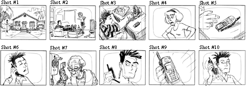
What happens if, instead of the current sequence, the panels are placed in a different order?
Example #1—1, 7, 6, 9, 10, 2 ,3, 4, 5, 8 (Grandma has called the boy from her house and, after hanging up, the boy is told to call his Grandma by his Mom.)
Example #2—5, 8,1, 7, 6, 9, 10, 2, 3, 4 (The boy calls Grandma, she admonishes him, the Mom says to call Grandma, and after he doesn't respond, reminds him again.)
Example #3—1, 3, 7, 5, 6, 9,10, 2, 4, 8 (The boy thinks about calling his Grandma, imagines what she would say, calls her, hangs up, and is told to call her by the Mom.)
Montage
Film editing can have its own unique logic as well, functioning in much the same manner as the brain with seemingly jumbled thoughts and images creating their own individual meaning. The groundwork for many of these techniques, later used by Alfred Hitchcock and others, was laid by a group of Soviet filmmakers—most notably Lev Kuleshov, Sergei Eisenstein and Vsevolod Pudovkin—who, in the early 1920s, began to experiment with film style and technique and especially with montage.
Montage, or collision editing, is done by splicing together a rapid sequence of carefully selected shots to evoke a specific emotional or intellectual response. The Russians' premise was that each shot derived meaning from the context in which it was placed. If the context changed, the meaning of the shot and the sequence also changed.
Montage, in the modern sense of the word, often refers to sequences where several shots have been edited together to compress a series of events that happen over time (e.g., sequences of young couples falling in love, scenes with flying calendar pages, etc.).
Psycho
In Psycho, Alfred Hitchcock's famous shower scene uses a rapid series of extreme close-ups to build suspense and heighten the sense of panic. Many viewers believe they have seen a very brutal stabbing, even though the knife is never shown piercing the body of the victim.
Potemkin
This sequence in Sergei Eisenstein's 'Potemkin', one of the most famous in film history, recounts the brutal suppression of Russian workers and sympathizers following the death of proto-revolutionary figure Vakulinchuk onboard the Potemkin. Crewmen on the ship had mutinied due to oppressive working conditions and when they arrive at Odessa townspeople came to pay respects for Vakulinchuk and support the workers ... the film itself is based upon the failed 1905 Russian Revolution ... the Odessa sequence is a frightening precursor of government suppression of dissent throughout the 2Oth century, including, but certainly not limited, to Hungary (1956), Czechoslovakia (1968), Soweto (1976), Tiananmen Square (1989) - even Kent State (1970).
The Odessa Steps sequence in Eisenstein's The Battleship Potemkin, is the classic example of montage. In this sequence, the Czar's army is quashing an uprising. Eisenstein uses editing to show the fear of the people, their escalating panic, the tragedy of innocent bystanders as a baby in a carriage careens helplessly down the steps, and the intensifying threat of the soldiers, their guns and artillery.
Source: Young Minds Inspired and The Academy of Motion Picture Arts and Sciences
____________________________________________
For more information on narrative structures and post-production, click here and click here for class notes (courtesy and copyright of Prof. Christopher Moore).
JANET MURRAY: "HARBINGERS OF THE HOLODECK"
Murray, Janet. (1997). "Harbingers of the Holodeck", Hamlet on the Holodeck. New York: Free Press, 1997.
The final quarter of the twentieth century marks the beginning of the digital age. Starting in the 1970s, computers have become cheaper, faster, more capacious, and more connected to one another at exponential rates of improvement, merging previously disparate technologies of communication and representation into a single medium. The networked computer acts like a telephone in offering one-to-one real-time communication, like a television in broadcasting moving pictures, like an auditorium in bringing groups together for lectures and discussion, like a library in offering vast amounts of textual information for reference, like a museum in its ordered presentation of visual information, like a billboard, a radio, a gameboard, and even like a manuscript in its revival of scrolling text. All the major representational formats of the previous five thousand years of human history have now been translated into digital form. There is nothing that human beings have created that cannot be represented in this protean environment, from the cave paintings of Lascaux to real-time photographs of Jupiter, from the Dead Sea Scrolls to Shakespeare's First Folio, from walk-through models of Greek temples to Edison's first movies. And the digital domain is assimilating greater powers of representation all the time, as researchers try to build within it a virtual reality that is as deep and rich as reality itself.
The technical and economic cultivation of this fertile new medium of communication has led to several new varieties of narrative entertainment. These new storytelling formats vary from the shoot-'em-up videogame and the virtual dungeons of Internet role-playing games to the postmodern literary hypertext. This wide range of narrative art holds the promise of a new medium of expression that is as varied as the printed book or the moving picture. Yet it would be a mistake to compare the first fruits of a new medium too directly with the accustomed yield of older media. We cannot use the English theater of the Renaissance or the novel of the nineteenth century or even the average Hollywood film or television drama of the 1990s as the standard by which to judge work in a medium that is going through such rapid technical change.
In 1455, Gutenberg invented the printing press-but not the book as we know it. Books printed before 1501 are called incunabula; the word is derived from the Latin for swaddling clothes and is used to indicate that these books are the work of a technology still in its infancy. It took fifty years of experimentation and more to establish such conventions as legible typefaces and proof sheet corrections; page numbering and paragraphing; and title pages, prefaces, and chapter divisions, which together made the published book a coherent means of communication. The garish videogames and tangled Web sites of the current digital environment are part of a similar period of technical evolution, part of a similar struggle for the conventions of coherent communication.'
Similarly, new narrative traditions do not arise out of the blue. A particular technology of communication-the printing press, the movie camera, the radio-may startle us when it first arrives on the scene, but the traditions of storytelling are continuous and feed into one another both in content and in form. The first published books were taken from the manuscript tradition. Malory's Morte darthur, written in manuscript in 1470, drew on prose and poetry versions of the Carnelot legend in both French and English, which in turn drew on centuries of oral storytelling. The elements of the story were all there already: the rise and fall of the hero Arthur, the gallantry of the knights, the love between Guinevere and Lancelot, and the destruction of the Round Table through civil war. But Malory's prose brought these elements together and introduced colloquial dialogue, more consistent plotting, and a pervasive tone of nostalgia. Fifteen years later, William Caxton took Malory's separate tales and bound them together into a single volume, with descriptive chapter headings that lured readers into the story. Only then, after such long episodic narratives were commonplace in publishing, could Cervantes write a contemporary tale like Don Quixote (1605), which marks the begin, ning of the European novel.
We can see the same continuities in the tradition that runs from nineteenth-century novels to contemporary movies. Decades before the invention of the motion picture camera, the prose fiction of the nineteenth century began to experiment with filmic techniques. We can catch glimpses of the coming cinema in Emily Brontë's complex use of flashback, in Dickens' crosscuts between intersecting stories, and in Tolstoy's battlefield panoramas that dissolve into close-up vignettes of a single soldier. Though still bound to the printed page, storytellers were already striving toward juxtapositions that were easier to manage with images than with words.
Now, in the incunabular days of the narrative computer, we can see how twentieth-century novels, films, and plays have been steadily pushing against the boundaries of linear storytelling. We therefore have to start our survey of the harbingers of the holodeck with a look at multiform stories, that is, linear narratives straining against the boundary of predigital media like a two-dimensional picture trying to burst out of its frame.
Click here to read the rest of the article and learn about "mutliform" narrative.
Film Editing/Terminology
Some of the terminology that a film editor uses includes:
Close-up (CU): A shot showing a detail only (ex., face only or hands only).
Cross-cutting: Cutting back and forth between two or more events or actions that are taking place at the same time but in different places. Cross-cutting is used to build suspense or to show how different pieces of the action are related.
Cut:An abrupt transition from one shot to another.
Cutaways: A cut away from the primary subject to something the filmmaker has decided is equally or more relevant at that time. Often cutaways consist of shots showing the reaction of one character to another. This is often used to compress time in what appears to be a seamless manner.
Dissolve: An overlapping transition between scenes where one image fades out as another fades in. Editors often use this to indicate a change in time and/or location.
Establishing Shot: A shot, usually taken from a distance, which establishes for the viewer where the action is to occur and the spatial relationship of the characters and their setting.
Extreme Close-Up(ECU): A detail of a close-up (eyes or mouth only, etc.).
Fade In: A shot that starts in darkness and gradually lightens to full exposure.
Fade Out: A shot that starts at full exposure and gradually fades to black.
Freeze-Frame: At a chosen point in a scene, a particular frame is printed repeatedly, given the effect of halting or "freezing" the action.
Jump Cut: A cut where two spliced shots do not match in terms of time or place. A jump cut gives the effect that the camera is literally jumping around.
Long Shot (LS): A shot taken at a considerable distance from the subject. A long shot of a person is one in which the entire body is in frame.
Medium Shot (MS): A shot framing a subject at a medium range, usually a shot from the waist up.
Reverse cutting: A technique alternating over-the-shoulder shots showing different characters speaking. This is generally used in conversation scenes.
Sequence Shot: An entire scene or sequence that is one continuous camera shot. There is no editing.
Close-up (CU): A shot showing a detail only (ex., face only or hands only).
Cross-cutting: Cutting back and forth between two or more events or actions that are taking place at the same time but in different places. Cross-cutting is used to build suspense or to show how different pieces of the action are related.
Cut:An abrupt transition from one shot to another.
Cutaways: A cut away from the primary subject to something the filmmaker has decided is equally or more relevant at that time. Often cutaways consist of shots showing the reaction of one character to another. This is often used to compress time in what appears to be a seamless manner.
Dissolve: An overlapping transition between scenes where one image fades out as another fades in. Editors often use this to indicate a change in time and/or location.
Establishing Shot: A shot, usually taken from a distance, which establishes for the viewer where the action is to occur and the spatial relationship of the characters and their setting.
Extreme Close-Up(ECU): A detail of a close-up (eyes or mouth only, etc.).
Fade In: A shot that starts in darkness and gradually lightens to full exposure.
Fade Out: A shot that starts at full exposure and gradually fades to black.
Freeze-Frame: At a chosen point in a scene, a particular frame is printed repeatedly, given the effect of halting or "freezing" the action.
Jump Cut: A cut where two spliced shots do not match in terms of time or place. A jump cut gives the effect that the camera is literally jumping around.
Long Shot (LS): A shot taken at a considerable distance from the subject. A long shot of a person is one in which the entire body is in frame.
Medium Shot (MS): A shot framing a subject at a medium range, usually a shot from the waist up.
Reverse cutting: A technique alternating over-the-shoulder shots showing different characters speaking. This is generally used in conversation scenes.
Sequence Shot: An entire scene or sequence that is one continuous camera shot. There is no editing.
Adobe Premier Tutorial Files
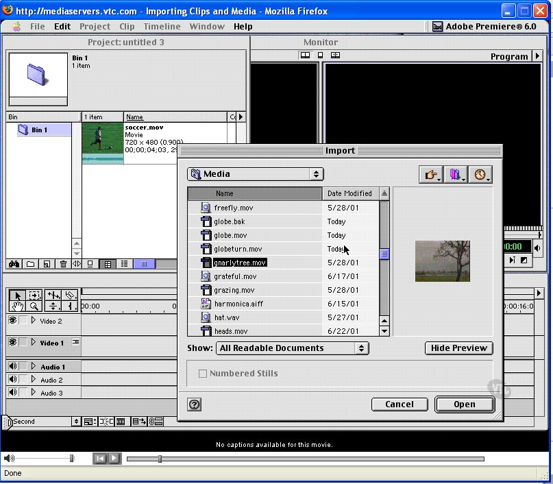
For some of the basic aspects of Adobe Premier Pro 2, there are some excellent tutorial quicktime movies that you can view, for free, on the web. Take a look at these to help remind you of some of the functions that we'll be learning.
Click here to visit the list of tutorials.
Introduction
About this Tutorial (02:45)
New in Premiere Pro 2.0 (07:15)
How Premiere Pro Works (05:27)
System Requirements (02:56)
Premiere's Interface
Interface Overview (03:37)
Customizing & Saving Workspaces (04:56)
Other Interface Components (06:07)
The Monitor Window (03:50)
The Timeline Window (05:04)
Premiere Project Settings
Setting Up a Premiere Project (04:52)
Presets & Custom Project Settings pt. 1 (05:46)
Presets & Custom Project Settings pt. 2 (03:50)
Auto Saving & Working with Offline Files (04:39)
Setting Up Scratch Disks (05:09)
Sunday, March 25, 2007
Assignment #5: Moving.Subject
Value: 25%
Duration: Three Weeks
Due: April 16
Format: Pairs
In the previous assignment, you created a fictionalized story with only a passing relationship to lived reality. In this project, you and a team member are asked to take an opposing approach by selecting a real, observable phenomenon and document its history and importance. The final product will be a short documentary video on a subject of your choice—human, animal, oddity, or inanimate object. The subject may be very familiar to you, or something rather foreign, which you wish to investigate further. In either case, your piece should attempt to provide new information, or a fresh perspective on a known subject. Some possible choices:
- Family member or important/meaningful individual (historical or inspirational figure, personal mentor, etc.)
- Monument, building, or location (natural phenomenon, coulees, Waterton Peace Park, etc.)
- Object, product, or brand (everyday tool, scissors, Windex, etc.)
- Band, collective, or social group (sports team, club, etc.)
- Lifestyle, philosophy, or belief system (hippies, pagans, etc.)
- Concept, theory, word (i.s. stupidity)
The first stage involves researching your subject to obtain information and background knowledge, as well as collecting imagery and media elements to integrate into the final production. For this exercise, a large percentage of your visual materials must be derived from still images and existing sources. The remaining can be new filmed material, but the entire piece could be composed entirely from found/archival sources.
You will prepare a script, showing scenes, types of shots, dialogue, voice-overs, captions, stills and graphics. By carefully preparing a storyboard you will more efficiently use your time and reduce the size of each digital video file making your process manageable.
You are also required to have at least one interview with an individual who can provide either information, history, or an opinion on your documentary subject. Other ideas to consider:
- Animated stills and graphics
- Titling sequences and credits
- Use of audio sound-effects
- Soundtrack/background music
- Use of silence or empty screen for punctuation
- Subtitles or captions
After selecting a topic and having conducted some initial research, you will be asked to draw up a rough storyboard and outline for the project. This information will be presented to the instructor for approval and guidance. Once you have been given the “go-ahead” the remainder of the project will be self-directed. During the process of filming and editing your video, it is likely that some variation from your initial storyboard may occur.
The final film will be approximately 1-3 minutes in length, depending upon the subject and the complexity of the editing process. The format and narrative approach can follow a traditional documentary style (think of nature documentaries and PBS), or it can be much more inventive. The style can mock or lampoon documentaries in a tongue-in-cheek fashion, use humour, satire, or bias. Virtually any subject can be explored (within reason).
The final submission will be a DVD quality *.avi video, rendered at 720x480 resolution. Further formatting details will be addressed in the class sessions.
Deliverables:
- 1 Windows *.avi video file, approximately 1-3 minutes in length
- Videos must be 720x480 and rendered with Microsoft avi compression
- Provide a brief text file outlining each individuals’ contributions to the filming and editing
- Include the printed script with your submission
- Submit all digital materials on a non-returnable CD or DVD (one per team)
- Upload your video to YouTube and imbed link on your blog journal (sign up for a free account at www.youtube.com)
Evaluation will be based upon the following criteria:
- Has the team exercised creativity and risk-taking in completing this exercise?
- Do the videos follow the technical requirements outlined in the assignment specifications?
- Does the project successfully employ cinematographic techniques – edits, pans, etc.?
- Has the team used innovative or creative techniques without relying on live footage?
- Are audio tracks, effects, and transitions used effectively?
- Is there a consistency of style (when appropriate) throughout the video?
- Has the team invested an adequate level of energy and engagement to create a compelling composition?
Duration: Three Weeks
Due: April 16
Format: Pairs
In the previous assignment, you created a fictionalized story with only a passing relationship to lived reality. In this project, you and a team member are asked to take an opposing approach by selecting a real, observable phenomenon and document its history and importance. The final product will be a short documentary video on a subject of your choice—human, animal, oddity, or inanimate object. The subject may be very familiar to you, or something rather foreign, which you wish to investigate further. In either case, your piece should attempt to provide new information, or a fresh perspective on a known subject. Some possible choices:
- Family member or important/meaningful individual (historical or inspirational figure, personal mentor, etc.)
- Monument, building, or location (natural phenomenon, coulees, Waterton Peace Park, etc.)
- Object, product, or brand (everyday tool, scissors, Windex, etc.)
- Band, collective, or social group (sports team, club, etc.)
- Lifestyle, philosophy, or belief system (hippies, pagans, etc.)
- Concept, theory, word (i.s. stupidity)
The first stage involves researching your subject to obtain information and background knowledge, as well as collecting imagery and media elements to integrate into the final production. For this exercise, a large percentage of your visual materials must be derived from still images and existing sources. The remaining can be new filmed material, but the entire piece could be composed entirely from found/archival sources.
You will prepare a script, showing scenes, types of shots, dialogue, voice-overs, captions, stills and graphics. By carefully preparing a storyboard you will more efficiently use your time and reduce the size of each digital video file making your process manageable.
You are also required to have at least one interview with an individual who can provide either information, history, or an opinion on your documentary subject. Other ideas to consider:
- Animated stills and graphics
- Titling sequences and credits
- Use of audio sound-effects
- Soundtrack/background music
- Use of silence or empty screen for punctuation
- Subtitles or captions
After selecting a topic and having conducted some initial research, you will be asked to draw up a rough storyboard and outline for the project. This information will be presented to the instructor for approval and guidance. Once you have been given the “go-ahead” the remainder of the project will be self-directed. During the process of filming and editing your video, it is likely that some variation from your initial storyboard may occur.
The final film will be approximately 1-3 minutes in length, depending upon the subject and the complexity of the editing process. The format and narrative approach can follow a traditional documentary style (think of nature documentaries and PBS), or it can be much more inventive. The style can mock or lampoon documentaries in a tongue-in-cheek fashion, use humour, satire, or bias. Virtually any subject can be explored (within reason).
The final submission will be a DVD quality *.avi video, rendered at 720x480 resolution. Further formatting details will be addressed in the class sessions.
Deliverables:
- 1 Windows *.avi video file, approximately 1-3 minutes in length
- Videos must be 720x480 and rendered with Microsoft avi compression
- Provide a brief text file outlining each individuals’ contributions to the filming and editing
- Include the printed script with your submission
- Submit all digital materials on a non-returnable CD or DVD (one per team)
- Upload your video to YouTube and imbed link on your blog journal (sign up for a free account at www.youtube.com)
Evaluation will be based upon the following criteria:
- Has the team exercised creativity and risk-taking in completing this exercise?
- Do the videos follow the technical requirements outlined in the assignment specifications?
- Does the project successfully employ cinematographic techniques – edits, pans, etc.?
- Has the team used innovative or creative techniques without relying on live footage?
- Are audio tracks, effects, and transitions used effectively?
- Is there a consistency of style (when appropriate) throughout the video?
- Has the team invested an adequate level of energy and engagement to create a compelling composition?
Aural Literacy

In a culture largely informed by a strong visual bias, the rich world of sound is often overlooked, or overestimated in its power to communicate. Hearing and vision provide us access to separate, yet overlapping worlds.
Click here to read course notes on Aural Literacy (courtesy and copyright of Prof. Christopher Moore).
Acoustic Ecology
Barry Truax, Director of Research, World Soundscape Project, Department of Communication, Simon Fraser University, Burnaby, B.C.
"As researchers into every aspect of the acoustic environment, we feel that this paradox reveals the tendency of our culture to trade its ears for its eyes, that is, to rely more heavily on visual information and less and less on aural cues. One reads of blind people a few centuries ago leading normal, productive lives, compensating for their lack of visual sense by an amazingly acute aural faculty, and yet today the obliteration in both urban and rural environments of the subtle acoustic information that allowed such normal orientation and activity has turned this deficiency into a handicap. The areas now barred to these people (operating a motor vehicle, visual media, many industrial and scientific occupations, the many aspects of formal education now made difficult) reveal fundamental biases of our culture toward the visual in its vital institutions and conventions.
The same bias is abundantly apparent in the ways our society has contrived to talk about sound. Most of the visual terms already mentioned have been taken over directly into the sound vocabulary or translated analogously [compare AUDIOCENTRIC]. Colloquial language is similarly invaded: "Seen in this light, one must review each person's background, you see, and focus attention on putting the entire spectrum of viewpoints into perspective, having the foresight to overlook no apparent alternative that would cast a visible shadow of doubt or reflect an inability to make one's basic outlook transparently clear from any vantage point."
While the visual bias of such cliches may be merely amusing, the negative effects of the sonically imbalanced living environments of the world's industrialized nations are not. It is our contention that the cause of this predicament can be traced to the public's waning auditory skills - a basic inability to hear clearly by those responsible for this imbalance, by which we mean to include as much the citizen who buys noisy appliances and vehicles, as the architects who build noise into their (visually and structurally) advanced designs, and the manufacturers who do the same with products that are thoughtlessly unleashed into the sonic environment regardless of their harmful effects."
Generation Flash: Turntable and Flash Remixing
It became a cliché to announce that “we live in remix culture.” Yes, we do. But is it possible to go beyond this simple statement of fact? For instances, can we distinguish between different kinds of remix aesthetics? What is the relationship between our remixes made with electronic and computer tools and such earlier forms as collage and montage? What are the similarities and differences between audio remixes and visual remixes? Click here to read the rest of the article by Lev Manovich.
New Media News: Assignment Zero

Assignment Zero is a collaboration between Wired magazine and NewAssignment.net that asks the general public to participate in the process of writing news stories. Called "crowdsourcing," the experimental project combines the open-source tactic of Wikipedia with traditional journalism. Users can voluntarily take on assignments from the newsroom and upload their content, which is reviewed and tweaked by news editors. According to Wired's editor Chris Anderson, “This is an experiment in doing things differently, and maybe better. It doesn’t invalidate the way things have been done, but it allows us to bring in some nontraditional sources and approaches.”
Collaborative Visual Arts: Online art communities like Deviant Art, which give people a place to make and share online art, have already been crowdsourced for business purposes. Assignment Zero examines how the net allows artists to collaborate on a single work together -- where a product, traditionally produced by a single artist, is done by the crowd. They've collected a list of projects which are pushing the boundaries on collaborative art.
Click here to visit Assignment Zero.
Tuesday, March 20, 2007
Linking to Other Students' Web Sites
As part of the project, your "next" button should link to the home page of one of the other student's web site. Find your name on the list, and link to the person's name immediately below you. For example, Austin Bruce will link to Doug Campbell's web site. Enter in the URL in the Links area on your Properties Palette. Remember to name the very first page you want people to visit "index.htm".
Bruce, Austin C. (Austin)
http://www.uleth.ca/~austin.bruce
Campbell, Douglas K. (Doug)
http://www.uleth.ca/~doug.campbell2
Charumbira, Smiles J. (Job)
http://www.uleth.ca/~job.charumbira
Coffey, Brendan M. (Brendan)
http://www.uleth.ca/~brendan.coffey
Gadomski, Kevin M. (Kevin)
http://www.uleth.ca/~kevin.gadomski
Gibson, Kerry G. (Kerry)
http://www.uleth.ca/~kerry.gibson
Helfmann, Fredrick W. (Fred)
http://www.uleth.ca/~fred.helfmann
Klein, Daniel L. (Dan)
http://www.uleth.ca/~dan.klein
MacKinnon, Scott J. (Scott)
http://www.uleth.ca/~scott.mackinnon
McNaughton, Ryan J. (Ryan)
http://www.uleth.ca/~ryan.mcnaughton
Morris, Christopher C. (Chris)
http://www.uleth.ca/~chris.morris2
Mpere, Jonathan K.
http://www.uleth.ca/~jonathan.mpere
Oliver, Gordon J. (Gord)
http://www.uleth.ca/~gord.oliver
Ozar, Ryan D. (Ryan)
http://www.uleth.ca/~ryan.ozar
Pittman, Heidi J. (Heidi)
http://www.uleth.ca/~heidi.pittman
Pope, Jessica T. (Tiffany)
http://www.uleth.ca/~tiffany.pope
Pryor, Logan S. (Logan)
http://www.uleth.ca/~logan.pryor
Reimer, Jordan L. (Jordan)
http://www.uleth.ca/~jordan.reimer
Vienneau, Corey J. (Corey)
http://www.uleth.ca/~corey.vienneau
Wahba, George R. (George)
http://www.uleth.ca/~george.wahba
Warszawski, Damian A.
http://www.uleth.ca/~damian.warszawski
Zhao, Peng (Roc)
http://www.uleth.ca/~peng.zhao
Zucchelli, Tracey T. (Tracey)
http://www.uleth.ca/~tracey.zucchelli
Bruce, Austin C. (Austin)
http://www.uleth.ca/~austin.bruce
Campbell, Douglas K. (Doug)
http://www.uleth.ca/~doug.campbell2
Charumbira, Smiles J. (Job)
http://www.uleth.ca/~job.charumbira
Coffey, Brendan M. (Brendan)
http://www.uleth.ca/~brendan.coffey
Gadomski, Kevin M. (Kevin)
http://www.uleth.ca/~kevin.gadomski
Gibson, Kerry G. (Kerry)
http://www.uleth.ca/~kerry.gibson
Helfmann, Fredrick W. (Fred)
http://www.uleth.ca/~fred.helfmann
Klein, Daniel L. (Dan)
http://www.uleth.ca/~dan.klein
MacKinnon, Scott J. (Scott)
http://www.uleth.ca/~scott.mackinnon
McNaughton, Ryan J. (Ryan)
http://www.uleth.ca/~ryan.mcnaughton
Morris, Christopher C. (Chris)
http://www.uleth.ca/~chris.morris2
Mpere, Jonathan K.
http://www.uleth.ca/~jonathan.mpere
Oliver, Gordon J. (Gord)
http://www.uleth.ca/~gord.oliver
Ozar, Ryan D. (Ryan)
http://www.uleth.ca/~ryan.ozar
Pittman, Heidi J. (Heidi)
http://www.uleth.ca/~heidi.pittman
Pope, Jessica T. (Tiffany)
http://www.uleth.ca/~tiffany.pope
Pryor, Logan S. (Logan)
http://www.uleth.ca/~logan.pryor
Reimer, Jordan L. (Jordan)
http://www.uleth.ca/~jordan.reimer
Vienneau, Corey J. (Corey)
http://www.uleth.ca/~corey.vienneau
Wahba, George R. (George)
http://www.uleth.ca/~george.wahba
Warszawski, Damian A.
http://www.uleth.ca/~damian.warszawski
Zhao, Peng (Roc)
http://www.uleth.ca/~peng.zhao
Zucchelli, Tracey T. (Tracey)
http://www.uleth.ca/~tracey.zucchelli
Thursday, March 8, 2007
Dreamweaver MX: Tutorials

Using Tables to Design a Page Layout Tutorial
(Chapter 2)
HTML tables are an excellent solution for designing web page layout, because they are easy to modify and compatible with most browsers. You can use tables to structure the layout of content or to set the display of visual elements (such as images, rollover buttons or paragraphs of text). This tutorial focuses on using tables as a page layout element.
In the first section of the tutorial, you work in Standard view and insert a table in a page. In the latter section, you work in Layout view, where you use layout options to draw a table and table cells to design the layout.
Click here to download an Adobe Acrobat PDF file of the tutorial.
HTML Tables
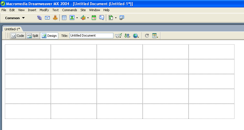
When working with html tables in Dreamweaver, here are some points to keep in mind:
1. The table above has 5 rows (horizontal) and 5 columns (vertical)
2. The table itself can be left justified, centered and right justified
3. The table has a width and a height (measured in pixels)
4. Each individual square is called a "table cell"
5. Each table cell:
- has a width and a height
- the content of each cell can be left justified, centered, right justified and justified horizontally
- the content of each cell can be vertically positioned to begin at the top, middle and bottom
- each cell can be coloured
- cells can be merged together, added or deleted using the Properties Palette
Image Alignment and Image Maps Tutorial (Chapter 3)
Working with images in Macromedia Dreamweaver MX is quite easy. You can use various Dreamweaver visual tools to insert an image. This tutorial presents you with image options you can apply once an image is inserted in a page. You will learn about aligning images and text, and setting space around an image. You’ll also learn how to use a single image to link to multiple web pages.
This tutorial is designed for beginning Dreamweaver users. It covers some basic features in Dreamweaver and will help you understand how to align images, as well as how to create an image map.
Click here to download an Adobe Acrobat PDF file of the tutorial.
Wednesday, March 7, 2007
Tips for Creating a Collage
1. Research other artists' work, and choose a collage style that you'd like to work in and inspire your own work. I've chosen the work below:
2. Analyze and deconstruct the elements of the collage and its style.
In the work above, the artist has chosen as the central element a crow, and made it have the greatest emphasis in the piece. By selecting a powerful symbol, the artist has the opportunity to play with related or contrasting elements in the rest of the work. As well, the collage will resonate emotionally and intellectually with the viewer.
Note that the text used in the background is placed on a mottled, textured background. The text itself employs key words that are related to the crow symbol: messenger, gift, prophecy, flight, life, etc. An additional theme is added with examples of ties or knots, and the words "untie me." A handwriting font has been used to suggest journalling, or a personalized message.
In contrast to the crow being a harbinger of death or evil, the artist has highlighted the words "hope" and "see past." It seems that the artist wants the viewer to "see past" the negative connotations of the crow, and recontextualize it into a message of hope. Another view of the crows wings are superimposed and made partially transparent in the background, suggesting angel wings, or at the very least, flight.
At the same time, the negative connotation of the crow is reinforced by using the number "13" on top of its head.
A compass dial is superimposed over a part of the bird, suggesting flight, movement and direction, one of the repeated themes.
There is a reinforcement of the negative themes, then a reconstruction of new themes throughout the piece. By juxtaposing these, it allows the viewer to participate in the construction of new meaning, as opposed to delivering a consistent, literal message.
3. So, how do I apply this to my own work?
Choose a powerful symbol that resonates with you. For example, a dragonfly is a symbol that resonates powerfully for me, and I will choose to use this in my own collage.
On the internet and at the library I researched the dragonfly - in particular the fluorescent blue dragonflies I've seen in Southern Alberta this summer. It is known as Boreal Bluet. I discovered that they have the largest eyes of any insect proportionate to the rest of their body, and that there are 432 facets per eye. I learned that they spawn in water, and love to skim across the surface of water. I didn't find any information on the meaning of dragonflies as a symbol...nevertheless, I reflected on what I find fascinating and beautiful about them, and ended up writing a poem.
the dragonfly
slipstreams cross the surface
of the mirror and is
reflected 423 times two
but doesn't see itself because
it's driven along by the current
it navigates with gossamer wings
and only angels know to where it goes
it distinguishes itself not from the
wind or the water or the waves of grass
it glides glistening a fluorescent blue
a sliver of sky let loose and fluttering
it flies by and by
In your own work, do some research on your symbol, write a poem, or find others' poems and writings you can use in your collage.
4. Choosing pictoral elements
I began with doing a search on www.photodisc.com for a background water image. This was my first attempt:
But I realized it was too 'pretty.' I was looking for a more dramatic and edgier effect. So I tried another water background, with more dark areas:
The effect is okay, but I realized the water image was overtaking the dragonfly image. I changed tacts, and did a search on PhotoDisc for an earth background, and found this:
I liked the monochromatic colours of this background and the fact that it did not overwhelm the dragonfly which should be my main emphasis. I decided to go with this background.
To decide on what other images to add, I looked through my poem, and saw the key words "angel," and "blades of grass." After doing a search on PhotoDisc, I found this cute but ugly stone angel. Again, when we think of angels, we usually think of a beautiful image - to play against that expectation, I chose an image that was stone, chubby, and roughly photographed.
It seemed to fit at the top right hand side, and I used "Multiply" blending on the layer to merge it with the background. I found an image of "blades of grass" which I pasted onto the bottom, and used "Hard Light" layer blend and a Gaussian Blur of 1.0 pixel.
I looked for a word that was meaningful, but not too literal within my poem, and decided upon "slipstream." I used Times New Roman, but made it italic to give it movement (like the word). I put it on two lines and put it in all lowercase to make it look more poetic. And I added an outer glow.
Finally, I added my poem using a script font, and used the Overlay effect on the layer, so that the text fades in and out - it's not entirely readable - just a little. Finally, I added "only angels know to where it goes" at the bottom, then "Rasterized" the layer so that I could apply a Wind filter effect to the text. I also made the opacity of the layer 75% so it's a bit transparent. Here's the final piece:
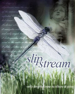
I could keep working on it, but for now, this should give you some ideas on how to construct your own collage.

2. Analyze and deconstruct the elements of the collage and its style.
In the work above, the artist has chosen as the central element a crow, and made it have the greatest emphasis in the piece. By selecting a powerful symbol, the artist has the opportunity to play with related or contrasting elements in the rest of the work. As well, the collage will resonate emotionally and intellectually with the viewer.
Note that the text used in the background is placed on a mottled, textured background. The text itself employs key words that are related to the crow symbol: messenger, gift, prophecy, flight, life, etc. An additional theme is added with examples of ties or knots, and the words "untie me." A handwriting font has been used to suggest journalling, or a personalized message.
In contrast to the crow being a harbinger of death or evil, the artist has highlighted the words "hope" and "see past." It seems that the artist wants the viewer to "see past" the negative connotations of the crow, and recontextualize it into a message of hope. Another view of the crows wings are superimposed and made partially transparent in the background, suggesting angel wings, or at the very least, flight.
At the same time, the negative connotation of the crow is reinforced by using the number "13" on top of its head.
A compass dial is superimposed over a part of the bird, suggesting flight, movement and direction, one of the repeated themes.
There is a reinforcement of the negative themes, then a reconstruction of new themes throughout the piece. By juxtaposing these, it allows the viewer to participate in the construction of new meaning, as opposed to delivering a consistent, literal message.
3. So, how do I apply this to my own work?
Choose a powerful symbol that resonates with you. For example, a dragonfly is a symbol that resonates powerfully for me, and I will choose to use this in my own collage.

On the internet and at the library I researched the dragonfly - in particular the fluorescent blue dragonflies I've seen in Southern Alberta this summer. It is known as Boreal Bluet. I discovered that they have the largest eyes of any insect proportionate to the rest of their body, and that there are 432 facets per eye. I learned that they spawn in water, and love to skim across the surface of water. I didn't find any information on the meaning of dragonflies as a symbol...nevertheless, I reflected on what I find fascinating and beautiful about them, and ended up writing a poem.
the dragonfly
slipstreams cross the surface
of the mirror and is
reflected 423 times two
but doesn't see itself because
it's driven along by the current
it navigates with gossamer wings
and only angels know to where it goes
it distinguishes itself not from the
wind or the water or the waves of grass
it glides glistening a fluorescent blue
a sliver of sky let loose and fluttering
it flies by and by
In your own work, do some research on your symbol, write a poem, or find others' poems and writings you can use in your collage.
4. Choosing pictoral elements
I began with doing a search on www.photodisc.com for a background water image. This was my first attempt:
But I realized it was too 'pretty.' I was looking for a more dramatic and edgier effect. So I tried another water background, with more dark areas:

The effect is okay, but I realized the water image was overtaking the dragonfly image. I changed tacts, and did a search on PhotoDisc for an earth background, and found this:

I liked the monochromatic colours of this background and the fact that it did not overwhelm the dragonfly which should be my main emphasis. I decided to go with this background.
To decide on what other images to add, I looked through my poem, and saw the key words "angel," and "blades of grass." After doing a search on PhotoDisc, I found this cute but ugly stone angel. Again, when we think of angels, we usually think of a beautiful image - to play against that expectation, I chose an image that was stone, chubby, and roughly photographed.

It seemed to fit at the top right hand side, and I used "Multiply" blending on the layer to merge it with the background. I found an image of "blades of grass" which I pasted onto the bottom, and used "Hard Light" layer blend and a Gaussian Blur of 1.0 pixel.

I looked for a word that was meaningful, but not too literal within my poem, and decided upon "slipstream." I used Times New Roman, but made it italic to give it movement (like the word). I put it on two lines and put it in all lowercase to make it look more poetic. And I added an outer glow.
Finally, I added my poem using a script font, and used the Overlay effect on the layer, so that the text fades in and out - it's not entirely readable - just a little. Finally, I added "only angels know to where it goes" at the bottom, then "Rasterized" the layer so that I could apply a Wind filter effect to the text. I also made the opacity of the layer 75% so it's a bit transparent. Here's the final piece:
I could keep working on it, but for now, this should give you some ideas on how to construct your own collage.
Creating Colour Schemes for your Web Site
Kuler
Adobe shows you how to create beautiful color schemes for every situation. Click here to visit the Kuler web site.
Color Match
Color Match shows you how to match your web site colors and will save you time when choosing a web site color scheme or color code. Click here to visit the site.
Using the sliders, choose a primary color. If you'd like to change a generated color into the primary color, click on it. You will then be given the matching hex (HTML) color code for you to use in your web site or export to photoshop or Illustrator.

Adobe shows you how to create beautiful color schemes for every situation. Click here to visit the Kuler web site.
Color Match
Color Match shows you how to match your web site colors and will save you time when choosing a web site color scheme or color code. Click here to visit the site.
Using the sliders, choose a primary color. If you'd like to change a generated color into the primary color, click on it. You will then be given the matching hex (HTML) color code for you to use in your web site or export to photoshop or Illustrator.
Dreamweaver: Defining your local root folder

Remember, it's important to do this each time you start Dreamweaver! Otherwise you'll mess up your links on your whole web site.
• Go to the SITE pulldown menu, and select NEW SITE. In the dialogue box that appears, make sure the tab on top says "Advanced."
• In the field "Site Name," type your name.
• In the field "Local Root Folder" click on the icon, and find your Web site folder. Click "Choose."
• Click OK, and then DONE.
• Make sure your folder and files show up in your FILES floating palette.
Dreamweaver MX: Properties Palette

Dreamweaver Instructions
Click here to view a page with some basic Dreamweaver Instructions for designing your web site.
The topics include:
• Creating your Web Site Folder
• How do I define my LOCAL ROOT FOLDER?
• What palettes should I have selected once I open Dreamweaver?
• Properties Palette
• How to make a table
• What size should my copy be?
• How do I create a rollover image for my navigational bar?
• How do I insert an image?
• How do I add a colour to my table cell?
• How do I add colour to the background of my Web page?
• How do I create Portfolio pages?
• How do I FTP my files to the World Wide Web?
The topics include:
• Creating your Web Site Folder
• How do I define my LOCAL ROOT FOLDER?
• What palettes should I have selected once I open Dreamweaver?
• Properties Palette
• How to make a table
• What size should my copy be?
• How do I create a rollover image for my navigational bar?
• How do I insert an image?
• How do I add a colour to my table cell?
• How do I add colour to the background of my Web page?
• How do I create Portfolio pages?
• How do I FTP my files to the World Wide Web?
Beyond Usability and Design: The Narrative Web
by Mark Bernstein
Published in: Brand Arts, State of the Web, Usability, User Interface Design
The web is currently torn by two strong forces, seemingly irresistible and irreconcilable. On the one hand, usability and interface engineering argue for simplicity, consistency, and clarity – for a starkly functional minimalism. On the other, emerging web standards and technologies nourish a continuing efflorescence of new approaches to web design. On the one hand, rigid hierarchical structure, branded as Information Architecture, promises clarity and coherence; on the other, the same rigidity seems to offer sterility and boredom.
First one side darts ahead. The lead seems insurmountable. But wait – what’s this? Something new happens! The dark horse advances, sweeping ahead. A new competitor advances, sweeping ahead. Old design ideas fall by the wayside, old errors seem ridiculous, old approaches fall far behind.
But this tumultuous race, with cheerleaders on either side, ignores a third force: the power of narrative.
eNarrative everywhere
We see narrative everywhere. It’s a primitive urge, a way to tie cause to effect, to convert the complexity of our experience to a story that makes sense.
We want to see narrative everywhere. Stories are fun, exciting, comforting. This isn’t just a matter of bedtime stories and art. The saga of the Great Browser War, the Open Source tales, the stories of Bill (Gates) and Steve (Jobs), populate our work life and our weblogs. So, too, do tales of Rise and Fall – of individuals, companies, and websites.
The point is not that we should add stories to our sites to ensnare narrative-starved readers. The point is that the reader’s journey through our site is a narrative experience. Our job is to make the narrative satisfying.
Arcs of triumph
Surely a simple, transparent, efficient transaction cannot be the web’s highest aspiration. Simply serving the reader’s explicit needs will not and cannot create a memorable experience. If everything goes as expected – neither better nor worse than usual – our reader (or our customer) has no reason to remember the experience, or us. Perhaps they’ll come to us if they have a similar need some day, and happen to find us again; otherwise, why would they give us a second thought?
A forgettable experience is exactly right for peripheral web services like parcel tracking. Here, the service is intended specifically for addressing exceptions and averting problems. We don’t want you to remember tracking an overdue package; if the package is overdue, the sooner you find it and forget about the whole thing, the happier we’ll be. People who use your website to run errands or fix mishaps are a special case: move them in and out quickly, without fuss. But for the rest of your visitors – readers, browsers, shoppers, fans – you need to create a memorable narrative arc.
Click here to view TEN FRESH STYLES for web sites.
Published in: Brand Arts, State of the Web, Usability, User Interface Design
The web is currently torn by two strong forces, seemingly irresistible and irreconcilable. On the one hand, usability and interface engineering argue for simplicity, consistency, and clarity – for a starkly functional minimalism. On the other, emerging web standards and technologies nourish a continuing efflorescence of new approaches to web design. On the one hand, rigid hierarchical structure, branded as Information Architecture, promises clarity and coherence; on the other, the same rigidity seems to offer sterility and boredom.
First one side darts ahead. The lead seems insurmountable. But wait – what’s this? Something new happens! The dark horse advances, sweeping ahead. A new competitor advances, sweeping ahead. Old design ideas fall by the wayside, old errors seem ridiculous, old approaches fall far behind.
But this tumultuous race, with cheerleaders on either side, ignores a third force: the power of narrative.
eNarrative everywhere
We see narrative everywhere. It’s a primitive urge, a way to tie cause to effect, to convert the complexity of our experience to a story that makes sense.
We want to see narrative everywhere. Stories are fun, exciting, comforting. This isn’t just a matter of bedtime stories and art. The saga of the Great Browser War, the Open Source tales, the stories of Bill (Gates) and Steve (Jobs), populate our work life and our weblogs. So, too, do tales of Rise and Fall – of individuals, companies, and websites.
The point is not that we should add stories to our sites to ensnare narrative-starved readers. The point is that the reader’s journey through our site is a narrative experience. Our job is to make the narrative satisfying.
Arcs of triumph
Surely a simple, transparent, efficient transaction cannot be the web’s highest aspiration. Simply serving the reader’s explicit needs will not and cannot create a memorable experience. If everything goes as expected – neither better nor worse than usual – our reader (or our customer) has no reason to remember the experience, or us. Perhaps they’ll come to us if they have a similar need some day, and happen to find us again; otherwise, why would they give us a second thought?
A forgettable experience is exactly right for peripheral web services like parcel tracking. Here, the service is intended specifically for addressing exceptions and averting problems. We don’t want you to remember tracking an overdue package; if the package is overdue, the sooner you find it and forget about the whole thing, the happier we’ll be. People who use your website to run errands or fix mishaps are a special case: move them in and out quickly, without fuss. But for the rest of your visitors – readers, browsers, shoppers, fans – you need to create a memorable narrative arc.
Click here to view TEN FRESH STYLES for web sites.
Links for Experimental and Narrative Web Sites

The Narrative You May Anticipate...
The Narrative You Anticipate You May Produce is a non-linear narrative co-authored with Thomas Swiss.

Born Magazine
Born Magazine is an experimental venue marrying literary arts and interactive media. Original projects are brought to life every three months through creative collaboration between writers and artists.
http://www.digitalthread.com/webdesign/editorial_design/
You and We...A Collective Experiment
You and We is a random collective show of images and words challenging the notion of artist versus audience. Co-produced with Gabe Kean, the project has received over 8000 texts and 3000 images submissions from over 1200 contributors, and is still growing.
The Lines of Hand
The Lines of the Hand is an animated treatment of a short story by Julio Cortazar, co-authored with Anya Medvedeva.
Pop Experiment
Some beautiful examples of digital art/collage.
The Think Tank
The Think Tank is a kinetic installation created in collaboration with the artist known as Trimpin. A system of 24 bobbing chickens triggers MIDI pulses, a typewriter controlled by a solenoid array types text, between the two, a computer generates random text based on GW Bush speeches analysis, and chicken pecking activity.
Designing a Bird from Jack Skin's Memory
by Eliot Khalil Wilson
We hated everything below us,
We’d come to hate the ground itself,
to dread the heavy ropes of gravity
drawing us down from blue
to a brooding green
which would billow in tan dust
like waves of fistic clouds.
Don't let me forget you.
Art+Drugs+Prince
Sébastien Chevrel
is an artist, designer and programmer focusing on interactive media. His web site provides links to a wealth of experimental designers.
a-hum
This project introduces stories of Brahmi (ancient Sanskrit letters) in a format that combines visual art, music and the latest web technology. The navigation is perfectly minimal and the delivery of this editorial is purposely deliberate and slow; be prepared for slowly evolving photography that is, however, worth the wait. The conceptual inspiration of the project is rooted in Buddhist philosophy and is intended to deliver a message on tolerance, compassion and the nature of being.
Digital Thread
editorial design is...
Well designed sites with an interesting story, narrative or editorial value that use graphic design and web technology to teach us something about the world. This site lists links to interesting and experimental sites.
Tuesday, March 6, 2007
Assignment #4 - Web.Body | Narrative Web Site Design

Click here to visit the experimental narrative site Distant Air.
Value: 20%
Duration: Two Weeks
Due: March 20
In many ways, the human body can be viewed as an interconnected network of nerves, arteries, and capillaries. It embodies a cyclical feedback and response mechanism which transmits and processes information, and thus, can be seen as a metaphor for network technologies.
The central nervous system (CNS) functions as a pipeline for communications within the body. The CNS represents a sophisticated system of links, which pass information and data between extremities, the brain, and other body parts. The various senses provide 'input' - collecting data on the conditions within the surrounding environment - which, in turn, is transported by the CNS, and processed by the brain. The brain 'processes' this input based on patterns, previous experiences, and reflex actions. This may result in a variety of 'outputs' - for example, one touches a hot stove; the brain reacts; the resultant 'output' is movement of the hand away from the heat source, and/or vocalization of pain.
At the cellular level, each cell contains identical DNA information, and responds to conditions at the level of the body as a whole. What this means, is that the overall state of the body is shared and circulated among all cells. In times of sickness, viral infection, or mineral deficiency, all aspects of bodily function are affected. The effect may be localized, but the 'data' is spread within the larger, self-contained 'network.'
The metaphor of the body as a network can also be extended beyond an internal framework. Upon entrance into culture and society, one becomes part of a larger network of social connections between people - friends, family, acquaintances, anonymous passers-by. Every interaction links us to a larger community of people, values, and ideologies. Think about the idea of Six Degrees of Separation. This theory claims that all individuals on the face of the earth can be linked through a maximum of 6 one-to-one relationships. If we extend this theory to network systems, the metaphor might read: "every node in a network can be traced or accessed through 4 clicks".
This project provides an introduction to network structures through analogy.
The preliminary stage involves mapping and defining a series of 4 nodes or locations within a larger structure. This activity addresses self representation and construction of meaning. In this assignment, you are not necessarily telling a story, but rather, are connecting information. Each node represents a collection of information, which together communicates a larger meaning.
To begin, you are required to produce a collaged image for your main web page, which serves as your home. This collage should contain at least four main elements which, when clicked, lead to another web page. Three of the pages will use the text and image you created for Assignment #3. The fourth page will link to another student’s main home page.
The only design criteria are that there is a level of consistency in the visual design of each node or web page, and that it is optimized for a resolution of 800x600 pixels.
Each “htm” page must be named as index.htm, 1.htm, 2.htm, and 3.htm, and appear within your “W” drive. Linked media, such as jpgs and gifts, must exist within a single folder labeled “images.”
One link on your home page will jump to one of your classmate’s nodes. In so doing, the entire class will be linked in a maze of parts and associations.
Deliverables:
- 4 HTM files, with accompanying media elements
- have all digital materials saved in both your class folder, and in your “W” drive
- be prepared to present your work during the following class
Evaluation will be based upon the following criteria:- Has the student exercised creativity and risk-taking in completing this exercise?
- Do the files follow the technical requirements outlined in the assignment specifications?
- Is the project fully-tested and functional?
- Are the media elements optimized for web delivery?
- Is there a sense of consistency across all pages?
- Has the student invested an adequate level of energy and engagement to create a compelling composition?
Choose Your Own Adventure: Interactive & Emergent Narratives

Click here to investigate digital narrative on Memory's Voices.
Click here to read class notes, courtesy and copyright of Prof. Christopher Moore.
Introduction to Web Design
• The internet isn’t located in any single place, isn’t based on any central computer, and isn’t overseen by any network manager.
• Developed in the 1960s as an experiment by the U.S. Department of Defense as a way to communicate - using TCP/IP. To ensure the internet could not be interrupted by enemy attack, TCP/IP was designed to create a decentralized system.
• Ways to communicate on the net:
• FTP (file transport protocol)
• Newsgroup
• Telnet (programs)
• WAIS (searches)
• World Wide Web (multimedia pages, hyperlinks and based on html)
• World Wide Web invented in 1990 by CERN, group of European scientists
• 1993 - Mosaic - first graphical browser
• 1994 Netscape Navigator 1.0 (Internet Explorer is now at version 7.0)
• Development is explosive!
Constant Change: Imagine a publishing medium where nothing is ever final, where designs can be changed at will and new information can be published within minutes of hearing it, where ideas can be tested and discarded-or built upon-as soon as you test your audience’s reaction to them, and to which readers can return time and time again and find new information at each visit. That’s the world of the web. Understanding its fast pace is an important key to success in the medium.
Definitions:
• Http: hypertext transfer protocol allows hyperlinks to another page anywhere in the world.
• HTML: hypertext mark up language - standardized language or format used by browsers
Nonlinear Design:
• The web is nonlinear: It’s about letting the visitor choose his or her own path through the information
• In this context, you’ve got to make each and every page well designed, attractive, easy to read and have relevant content
Each page important:
• Every page should entice the visitor to explore your site further and make it easy to do so
• It must introduce an idiosyncratic identity among the dozens of sites the visitors may view in the space of a few minutes.
Page layout is uncontrollable:
• Page layout and design isn’t entirely controllable by designer
• Defaults are different for each user – text size, font, screen resolution, screen brightness/contrast
• Different browsers make page appear differently – Internet Explorer, Firefox, Opera, Safari
• Different versions of browsers handle code differently
• Platforms affect appearance - PC or Apple Macintosh
• Fonts used on web page may not be installed on viewer’s computer so may not show as intended
• Good web design includes the art of creating pages that can be viewed successfully under a number of different conditions.
• Avoid using frames
• Keep it simple
Capabilities always growing:
• World Wide Web Consortium (W3C): A group, composed of volunteers from Internet software companies, academics and other interested parties, that oversees the development of Web technologies. Formed in the fall of 1995.
• HTML’s capabilities are changing all the time - HTML 2.0 - HTML 4.01.
• Designers must constantly educate themselves and designs must be updated regularly.
Download Time Sets the Standard:
• The Web is capable of all the multimedia associated with CD-ROM: immersive 3D graphics, animation, digital video.
• As band-width improves and sites become media-rich, producing a web site could demand all the skills of producing a film, requiring professional video and sound production - even actors
• One of the web designer’s greatest challenges is to execute ideas using the smallest possible file sizes.
• If users have to wait more than 5-10 seconds, they’re gone.
• Good web design means good content, well organized, and speed over everything else.
Process of Web Design
• Quick changes in technology may quickly put some tasks handled by production engineers into the hands of web designers
Managing the Project:
• Producer: the job of pulling together the ideas and expertise of individual team members into a coherent plan
• Account Manager: represents the client’s wishes to the team and communicates the team’s ideas and progress back to the client
Information Architecture:
• Planning of content
• Functions: online product sales or community meeting areas
• Product information, etc
• Information Architect: builds a structure for the site that holds the information and offers functionality described in creative brief.
• Site architecture requires very right-brain/left-brain integration. Organize information and realize how it will work onscreen.
• Content involves the services of a copywriter and editor.
• Information Architecture should be driven by human behaviour. You’ve got to make the system fit the user, not the other way around. Focus groups, user testing, and past experience with how users have reacted to earlier designs should be your guide.
• How is content organized and what is the hyperlink structure?
• Even more complex when animation and interactivity is involved: depends on the collaboration of a whole team of talents, including production engineers
• The process of information architecture should result in a document that defines the structure: a storyboard or a branching diagram
Page Architecture and Interface Design:
• Designers decide how the elements of each page will relate to one another and how they interact as a whole
• Create a navigation system
• Graphic Design: defines the “look and feel” for the information, directing the work of illustrators and HTML coders to create a logical, attractive and appropriate interface design.
Programming and Scripting:
• Beyond simple tools for interactivity (hyperlinks, e-mail) a programmer is required to develop things such as collecting data from forms or returning automated responses to a user’s input or actions
• Some designers know basic HTML, but specialized programmers are required for interactive interfaces, hooking in back-end databases, and creating custom behaviour using programming languages such as Java
• The link between programming and design has become even tighter (Flash animated sites)
Production:
• WYSIWYG HTML Editors (Dreamweaver)
• Production engineer’s responsibilities include: Setting up and saving the files in an appropriate directory structure in the server HTML coding, or verifying and fine-tuning HTML files supplied by designers
• Preparing graphics and other media for low-bandwidth transmission
• Writing any necessary scripts
• Creating and testing the hyperlinks
• Making sure the code works in target browsers
Publishing:
• The engineer copies the final files into the appropriate directories on an HTTP server (using an FTP program).
• Most web teams use a staging server on which final files are posted and links, scripts and other functions are tested before the site goes “live.”
Three Main Categories of Web Sites:
• Information publishing: onlnine newsmagazines or information sites such as www.nationalgeographic.com or www.uleth.ca. There is much up and down scrolling on these sites, and content is put into 'bite-sized' chunks with images to break the monotony of text
• Brochureware (brochure + software): Web site appears all on one screen - no scrolling is required. Often used for design companies.
• E-commerce (a combination of information publishing and brochureware + method of purchasing online): www.amazon.com for example
• Digital Storytelling (an experimental and artistic approach to web site design): see Memory's Voices
Subscribe to:
Posts (Atom)
![• The Anatomy of a Life and Style Cover [Gawker]](http://classes.uleth.ca/200603/nmed1000b/3/howtophotoshop.jpg)